Picture of the week: The colors of the Web
In a recent post, Ophelia wondered about the basis of people’s colours preference: Which colour do you prefer ? Have you always preferred it, or did your preference change ? Can you tell why you prefer pink to, let’s say, yellow ?
One of the problem here is that, as Ophelia noticed, we lack data, and methods to gather them. As usual, the web may change the debate. The blog COLOURlovers (colourlovers.com/business/blog) has just released an interesting study of the colors in the brands from the top 100 sites in the world (see also nmap.org/favicon).
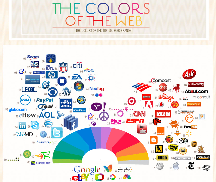
Unsurprinsingly, the web is dominated by red and blue.
More interesting for Ophelia’s question, the same team has looked at people’s colour choice when they present themselves on Twitter. By looking at the more than 1 Million people who have used their Themeleon tool (themeleon.com) to design their Twitter Profile in the past 3 months, they were able to paint a picture of the world connecting colors to locations and profile data. So far, the differences are not striking, but who knows what can be extracted form such data bases?
Looks like an interesting way to investigate Ophelia’s question: Why pink?
No comments yet