Picture of the week: How segregated is your city?
One of the tools that may change our view of culture is modelization. It helps us understand big phenomena such as language change or the dynamics of hot topics. One of the first and the most convincing use of models in social sciences probably comes from Nobel prize winner Thomas Schelling. In a famous paper, he showed that a small preference for one’s neighbors to be of the same color could lead to total segregation. He used coins on graph paper to demonstrate his theory by placing pennies and nickels in different patterns on the “board” and then moving them one by one if they were in an “unhappy” situation.
Now, cartographer Bill Rankin produced an astounding map
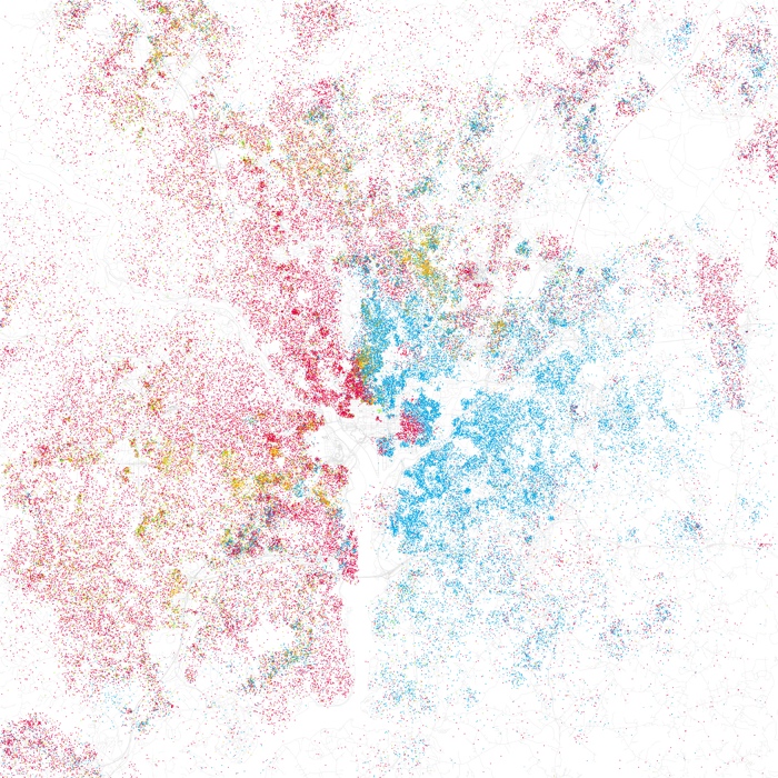
of Chicago (radicalcartography.net), which beautifully illustrates the segregation phenomenon. Eric Fischer saw these maps, and took it upon himself to create similar ones for the top 40 cities in the United States. Fisher used a straight forward method borrowed from Rankin: Using U.S. Census data from 2000, he created a map where one dot equals 25 people. The dots are then color-coded based on race: White is pink; Black is blue; Hispanic is orange, and Asian is green. Here, I borrow Cliff Kuang’s simple and efficient presentation. Washington, D.C., for example (see figure on the right), has a stark east/west divide between Blacks and Whites.
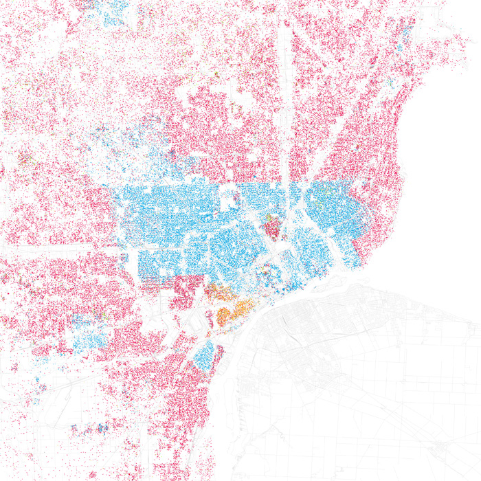
Detroit, meanwhile, is marked by the infamous Eight Mile beltway, which serves a precise boundary for the city’s black and white populations. Integration is almost non existent:
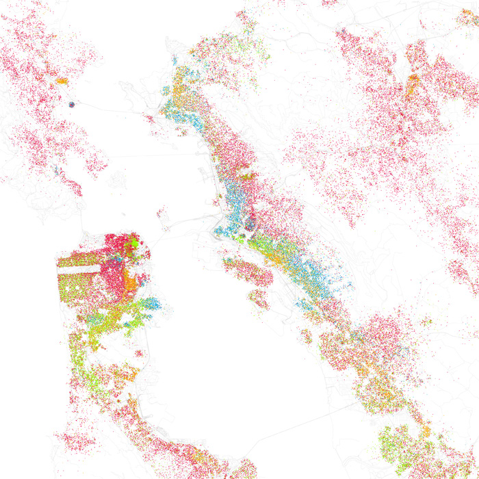
However, other cities present better pictures of racial integration. The San Francisco Bay, for example. While some parts of San Francisco are very, very white, large tracts of the outlying bay communities such as Oakland are quite integrated — perhaps partly because no one minority totally dominates a single area:
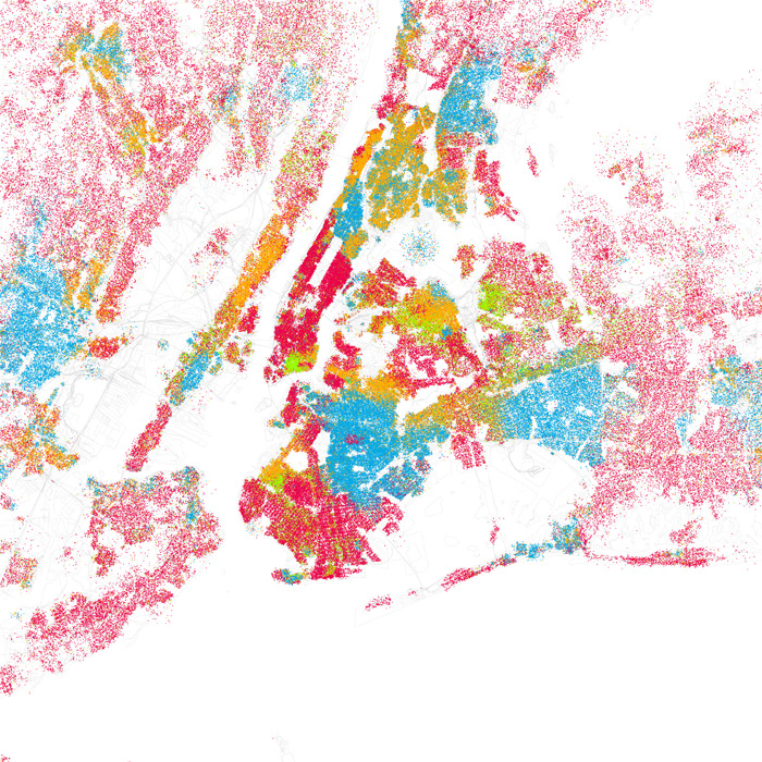
That’s not the case with New York, however: There are areas of extreme racial concentration. But the sheer number of people in those areas means that the boundaries become intensely rich areas of cross-cultural ferment:
For more maps, see Cliff Huang’s post and and Eric Fisher’s maps (on Flickr).
No comments yet